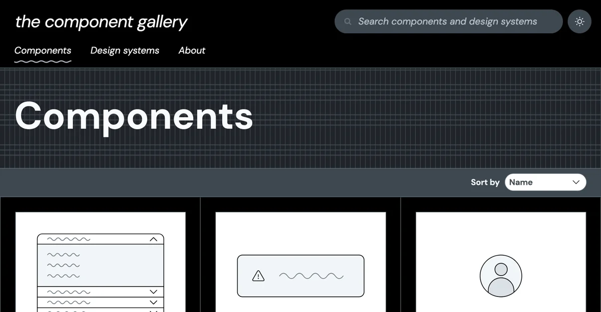
The Component Gallery is a valuable resource for those involved in building component-based user interfaces. It serves as an up-to-date repository of interface components, drawing examples from the world of design systems. The gallery features a diverse range of components, including the Popover, which pops up from another element and can contain interactive elements, triggered by a click rather than a hover. The Rating component allows users to set or view a star rating for a product or item. The Accordion is a vertical stack of interactive headings that toggles the display of further information. Quotes are used to display quotations from various sources. Pagination splits information over multiple pages, and Tabs provide a way to navigate between multiple panels. Other components like Buttons, Breadcrumbs, and more are also available. With its extensive collection and detailed usage guidelines and code examples, The Component Gallery is a must-visit for UI designers and developers.

The Component Gallery
Discover a wide range of interface components in The Component Gallery for enhanced UI design.

Top Alternatives to The Component Gallery
DeepMind Lab
DeepMind Lab is an AI-powered 3D learning environment for agents
promptcenter.ai
promptcenter.ai is an AI-powered platform with diverse functions
TensorFlow
TensorFlow is an AI-powered ML platform that simplifies model creation
TypeflowAI
TypeflowAI is an AI-powered tool builder that saves time and boosts efficiency
AItoZee
AItoZee is an all-in-one AI platform with diverse tools
Modal
Modal is a serverless cloud infra for AI, ML, and data apps
Genspark
Genspark is an AI-powered search engine that saves time and delivers better results.
Recogni
Recogni is an AI-powered inference compute system that optimizes performance
Impact AI
Impact AI is an AI-powered platform that enhances AI product delivery
Agentverse
Agentverse is an AI platform for developing and deploying agents
Proseoai
Proseoai is an AI-powered platform offering diverse services
Twinword Ideas
Twinword Ideas is an AI-powered keyword tool that saves time
Lume AI
Lume AI is an AI-powered data mapping tool that boosts efficiency
Archie Labs
Archie Labs is an AI-powered platform that builds apps 10x faster
Tap4 AI
Tap4 AI is a platform with a vast collection of AI tools
PyTorch
PyTorch is an AI-powered framework that enables diverse applications
MLflow
MLflow is an open source MLOps platform for better AI apps
AI Tools Arena
AI Tools Arena offers a diverse range of AI-powered tools
Gretel.ai
Gretel.ai is an AI-powered synthetic data platform that improves models
local.ai
local.ai is an AI-powered tool that simplifies management and inferencing
Secureframe
Secureframe is an AI-powered compliance tool that saves time and reduces risk